Stakeholders, Teams and Users
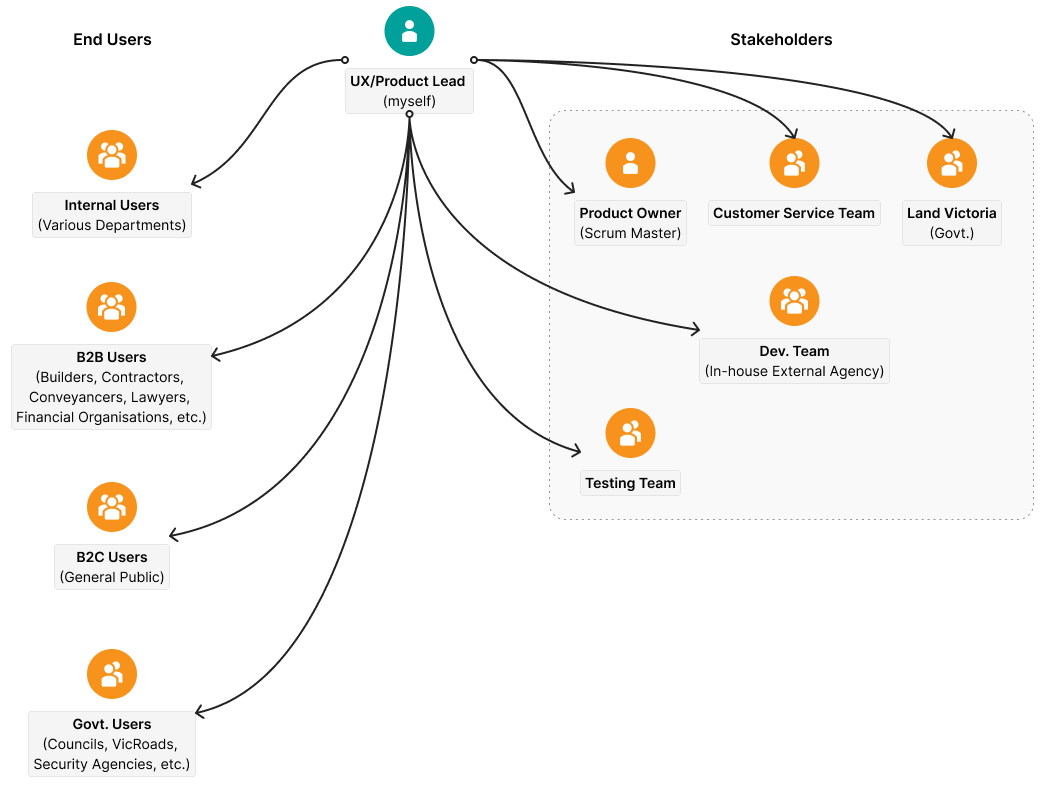
The biggest complexity of the project was the number of stakeholders involved, both internal and external. Decision making and stakeholder management was the toughest part of the project. According to our management I managed the stakeholders quite well.
Before diving into the redesign of LANDATA, I conducted extensive research to fully understand the pain points of our diverse user base. This research phase was pivotal in ensuring that our design decisions were rooted in actual user needs and business goals. Here’s how we approached it:
-
Workshops with Key Teams and Stakeholders
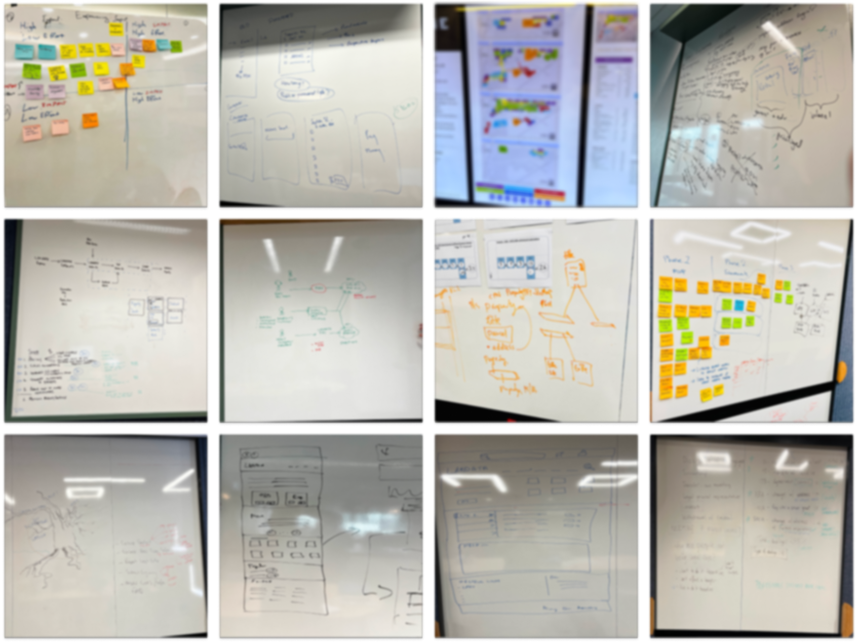
I facilitated workshops with cross-functional teams, including Customer Service, Product, and Development, to gather firsthand insights. The Customer Service team, in particular, provided valuable information through real user complaints and feedback, which directly influenced our prioritization of pain points.
-
Website Traffic and Behavior Analysis
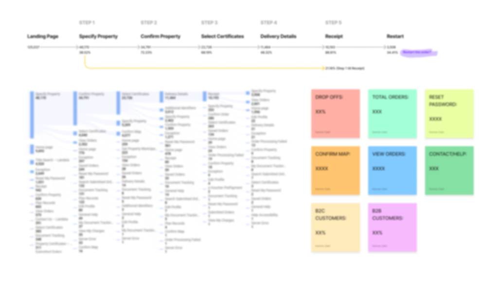
Using Google Analytics and Power BI, I analyzed user behavior on the existing LANDATA platform. I focused on identifying areas of high drop-off and friction in the user journey, understanding which features or pages were contributing to user frustration. This data-driven approach helped pinpoint the areas where users were getting stuck or abandoning transactions.
-
Competitor and Industry Benchmarking
I carried out a competitive analysis to compare LANDATA’s user experience with other property transaction platforms, both local and global. This allowed us to identify best practices in the industry and set a benchmark for the redesign.
-
User Interviews and Contextual Inquiry
I conducted a series of in-depth user interviews with a diverse group of users, including first-time homebuyers, retirees, and professional conveyancers. These interviews were designed to uncover specific challenges, emotional barriers, and common pain points encountered during their interactions with LANDATA. I also engaged in contextual inquiry, observing users interacting with the platform in real-time to capture their behaviors, frustrations, and thought processes.
-
Usability Testing and Guerilla Testing
To validate early design hypotheses, I facilitated usability testing sessions where participants were asked to complete key tasks on both the existing and proposed versions of LANDATA. This allowed us to directly compare how the redesign improved the user experience. Additionally, I conducted guerilla testing in informal settings to gather quick feedback on low-fidelity wireframes, enabling us to iterate rapidly on early-stage concepts.
-
Data Synthesis and Persona Development
After synthesizing the qualitative and quantitative data, I developed user personas to represent our core users, ranging from tech-savvy buyers to older, less tech-savvy investors. These personas guided all subsequent design decisions, ensuring we addressed the diverse needs of our user base.
Website Traffic Analysis
Support Team Reports
Workshops
Research, Exploration, Codesign, etc.
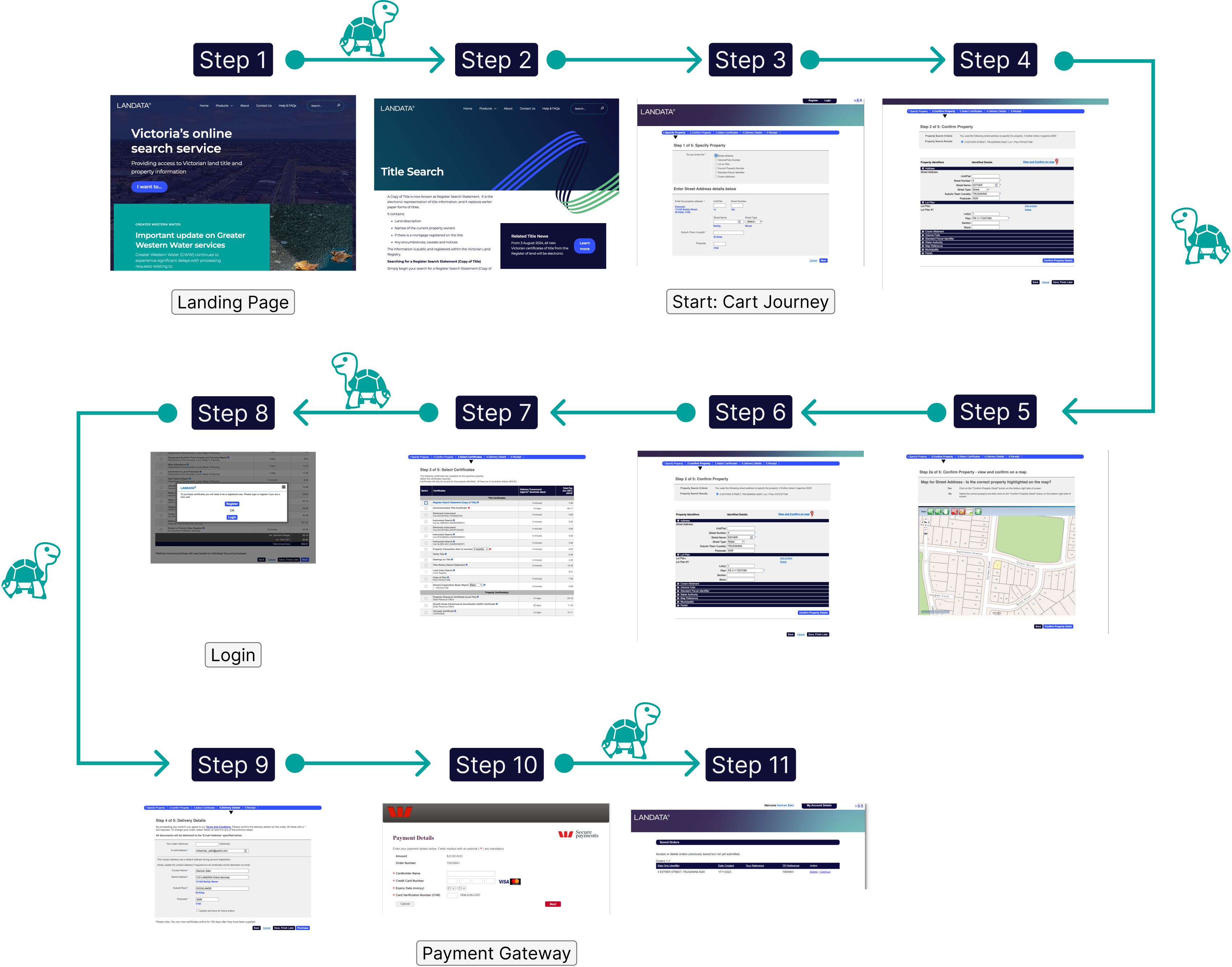
Existing User Journey
Our Personas
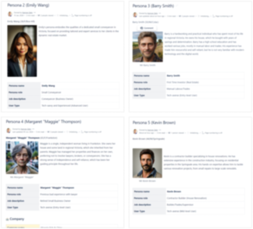
Liam Thompson (First-Time Homebuyer): Tech-savvy but unfamiliar with property jargon.
Emily Wang (Conveyancer): A busy professional looking for speed and efficiency.
Barry Smith (First-Time Investor): Tech-averse, needing clear and simple instructions.
Maggie Thompson (Retired Property Owner): Skeptical of legal professionals, determined to handle transactions on her own.
Kevin Brown (Builder/Contractor): Hands-on but not digitally fluent.
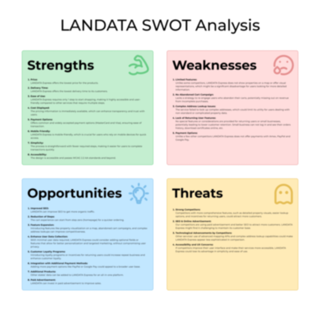
SWOT Analysis
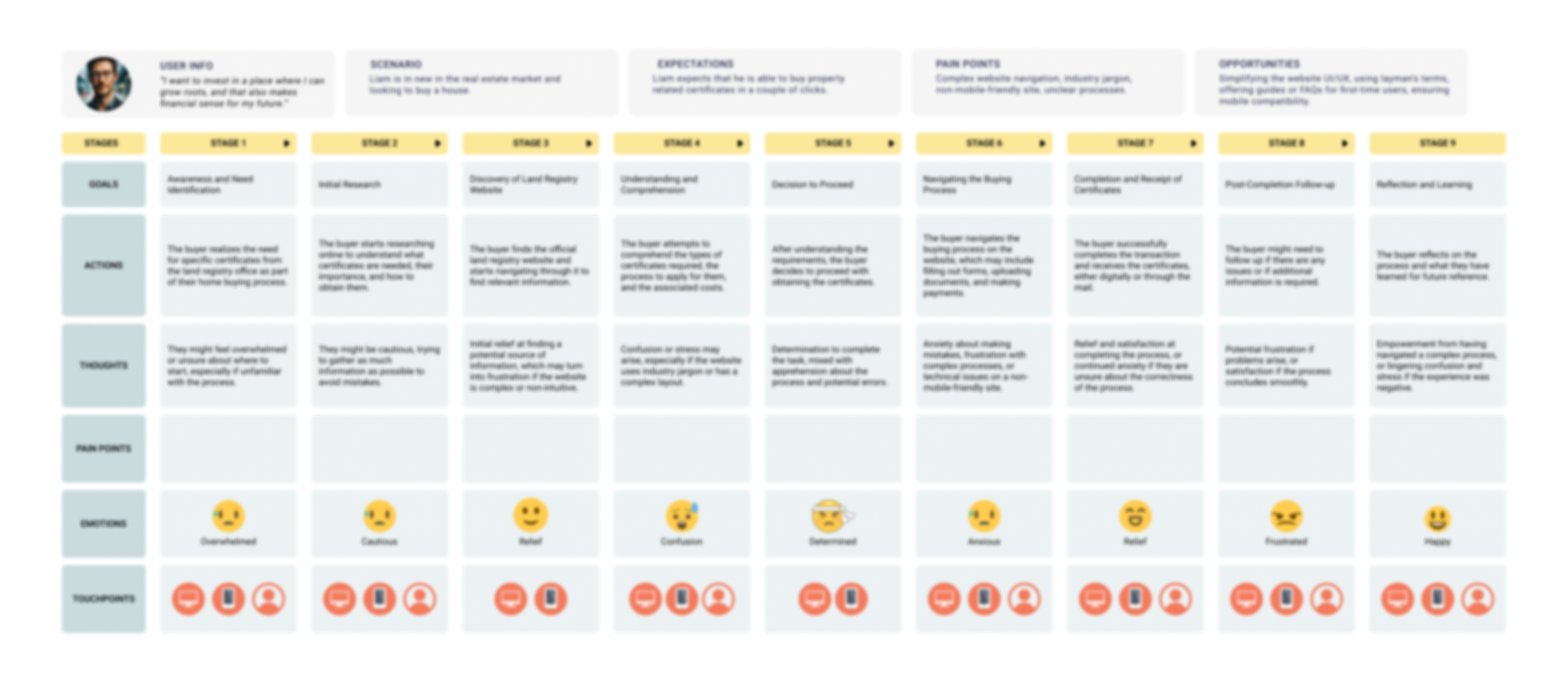
User Journey Mapping
Low Fidelity Diagrams
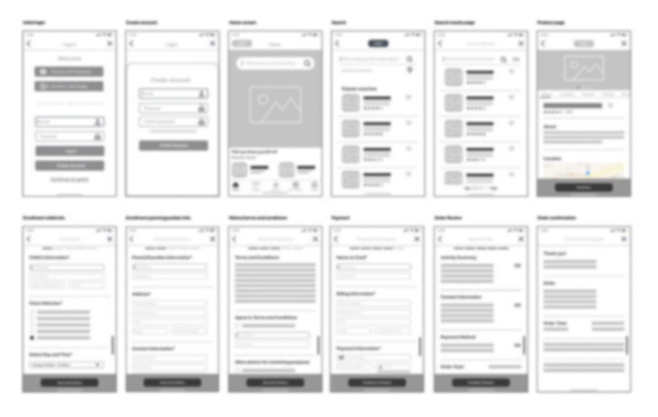
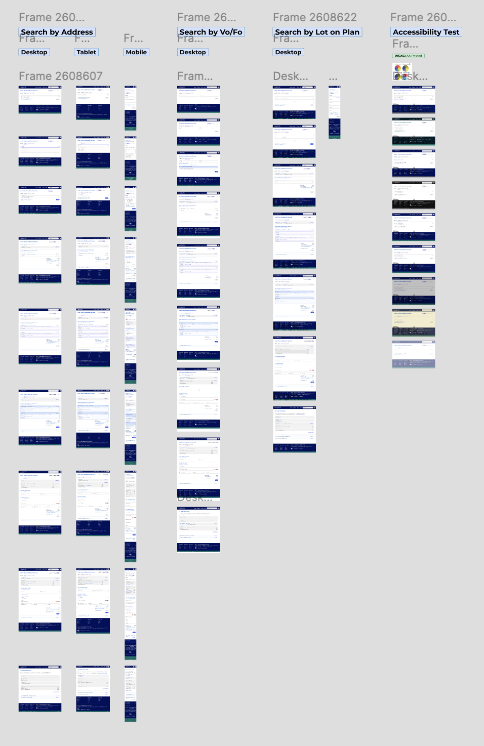
Once the research phase was complete, I began sketching low-fidelity wireframes and prototypes. These early models helped identify usability issues and allowed us to test initial design concepts with users before moving on to high-fidelity designs.
Design System
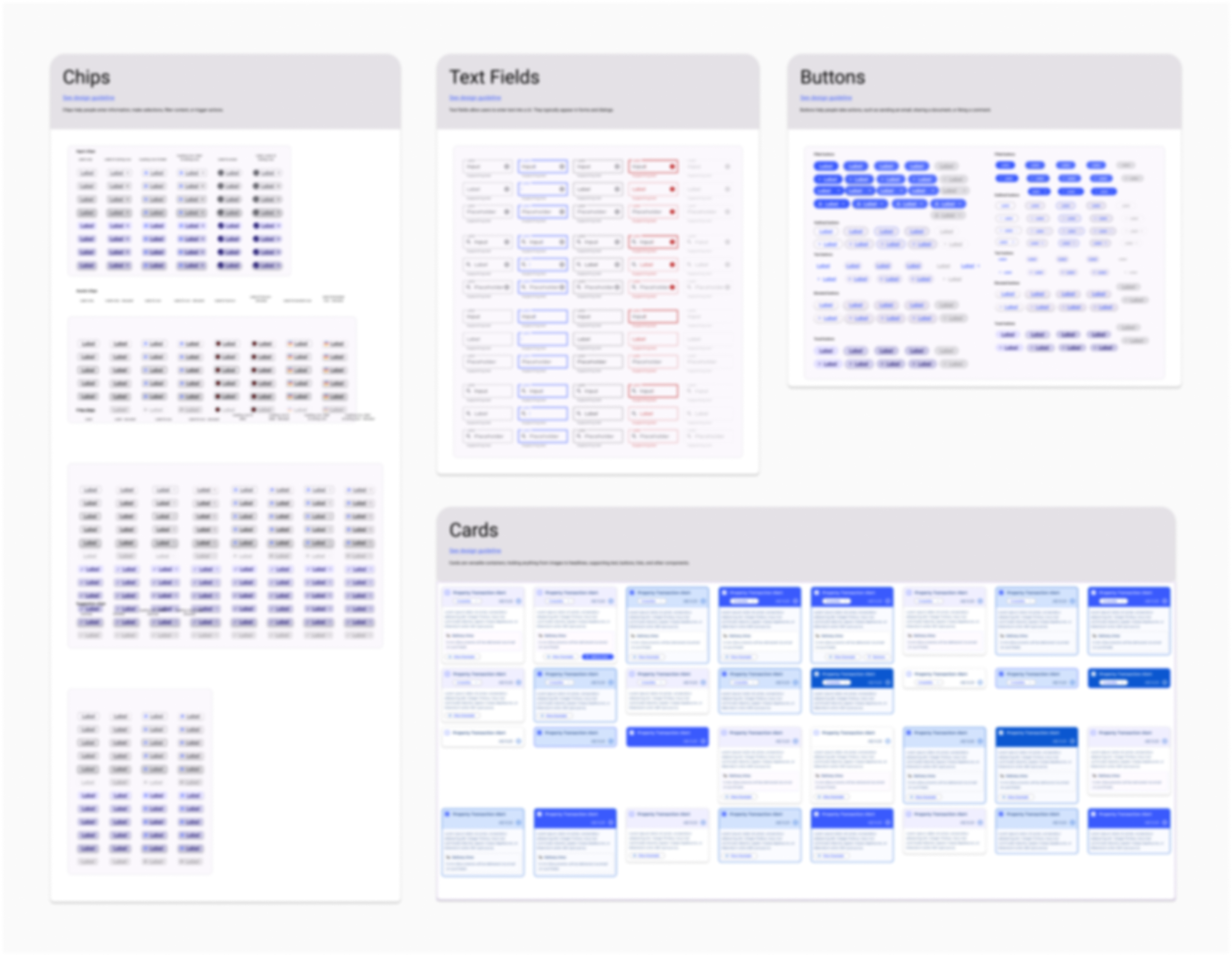
One of the most transformative aspects of this project was the introduction of a new design system at SERV. Using Google’s Material Design 3, I created a comprehensive design system with accessible, reusable components. This system was crucial for ensuring consistency across all touchpoints of the LANDATA platform while keeping accessibility at the forefront.
Accessibility and Onboarding the Team
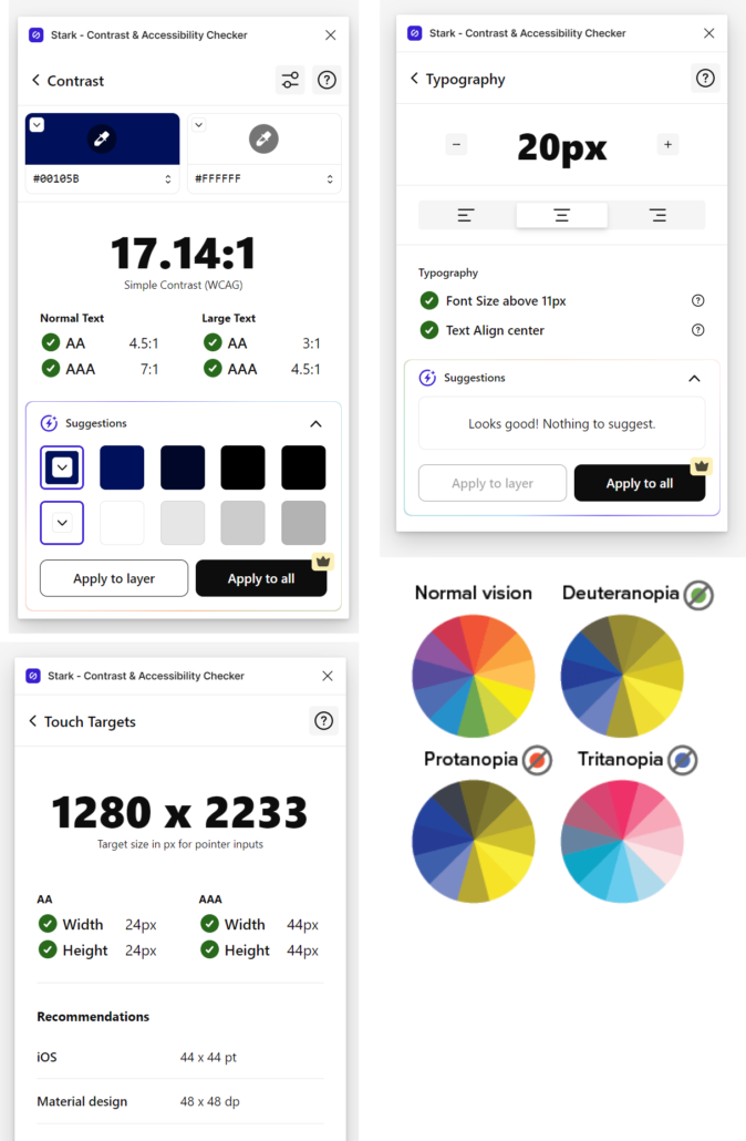
Accessibility was a key focus throughout the redesign. I adhered to WCAG 2.2 AA standards to ensure the platform would be inclusive for all users, including those with disabilities. As part of the process, I onboarded the design and development teams with accessibility best practices, highlighting the importance of designing for users with diverse needs—such as the elderly, users with color blindness, or those for whom English is a second language.
The Solution
Crafting a User-Centric Experience
Step 1:
Making the Website Mobile-Responsive
We completely overhauled the design using Material Design 3 to ensure mobile responsiveness, allowing users to access the platform seamlessly across all devices.
Step 2:
Removing the Jargon
We replaced confusing industry terms with simple, plain language that everyone could understand. Tooltips were added to clarify unavoidable technical terms.
Step 3:
Streamlining the Buying Process
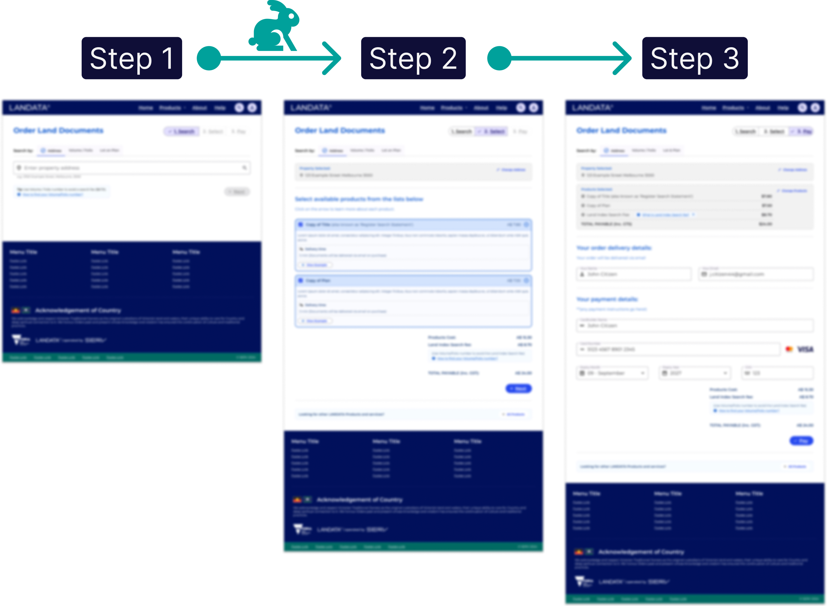
The complex, multi-step process was simplified into three clear steps: Search, Select, Pay. This made transactions faster, easier, and far less error-prone.
3 Step Purchase Experience
50-70% Less Time
High Fidelity Design