
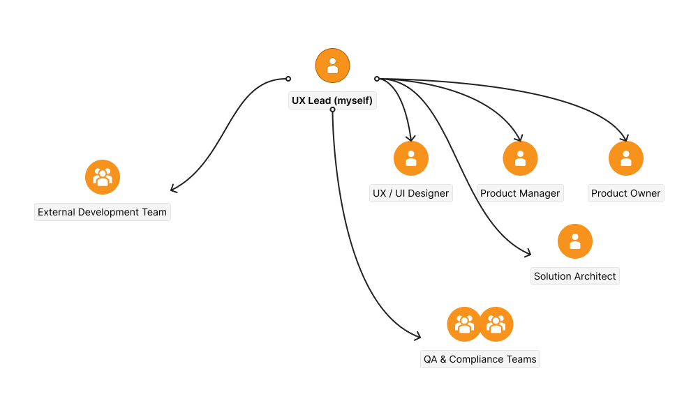
Stakeholders
- UX Lead (myself)
- UX/UI Designer
- Product Owner
- Product Manager
- External Development Team
- Solution Architect
- QA and Compliance Teams
UX Process
Research
To fully understand the users and challenges, I conducted in-depth user research:
- Fullview analysis and user interviews to gain insights into user behavior, pain points, and unmet needs.
- Key findings: Users felt overwhelmed by the length of the loan application form and lacked access to essential data during the process, leading to frequent errors.
User Personas
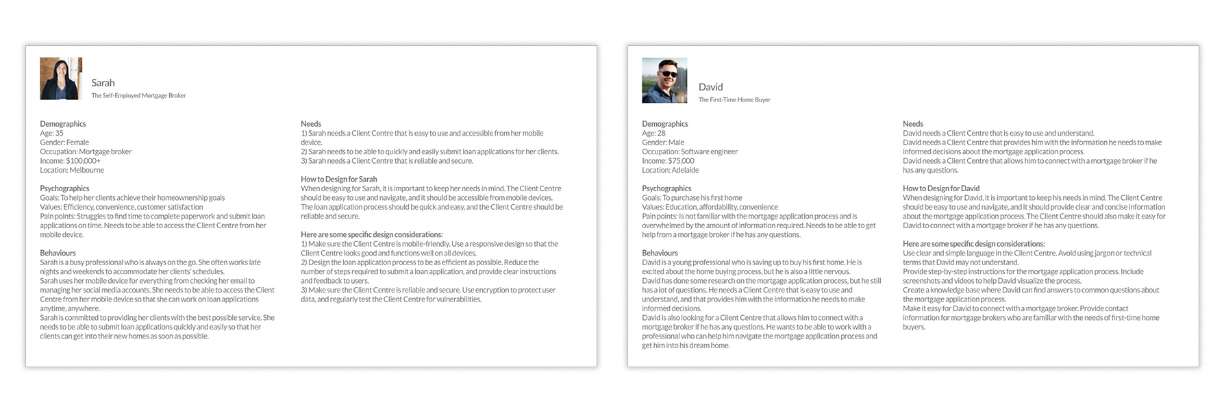
We developed two key personas to represent our users:
- Sarah (Mortgage Broker): Self-employed, always on the go, requiring mobile accessibility and the ability to quickly submit loan applications.
- David (First-Time Home Buyer): Unfamiliar with the mortgage process, needing the platform to be simple, intuitive, and easy to navigate.
Ideation and Solution Development
Co-Design Workshop
To foster innovation and collaboration, I organized a co-design workshop with key stakeholders, including the UX team, product managers, and developers. Together, we brainstormed and prioritized solutions:
- Key outcomes: Simplification of the form, improved information architecture, and the introduction of validation mechanisms to reduce errors.
Usability Testing and Iteration
We created clickable prototypes in Adobe XD and conducted multiple rounds of usability testing with real users:
- Testing was conducted using online platforms like Dovetail and Miro.
- Feedback from testing led to iterative refinements, including breaking down the form into smaller sections, adding a real-time progress bar, and providing clearer guidance throughout the application process.
Design System and High-Fidelity Design
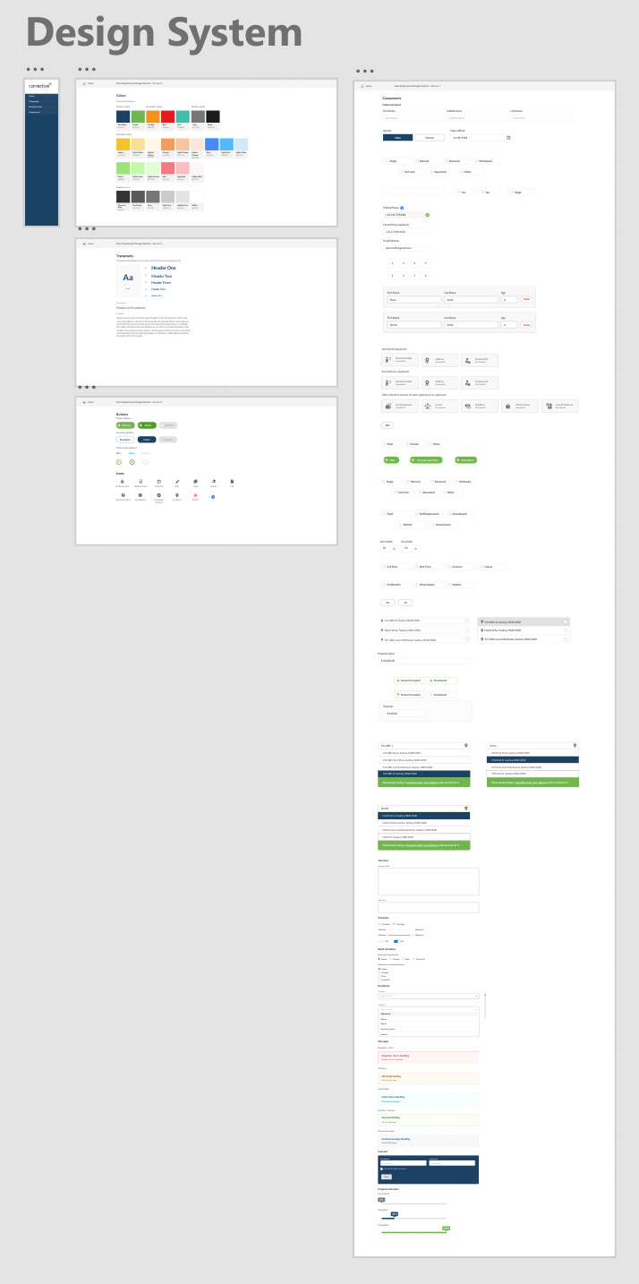
I introduced a design system to standardize the design language across all touchpoints, ensuring scalability and accessibility:
- Accessible components: Used widely accessible fonts, icons, and UI elements to ensure that the design could be adapted to any white-label standard in Version 2.0.
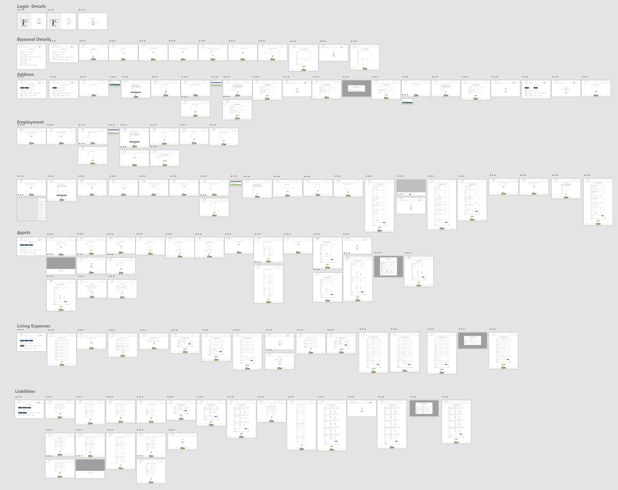
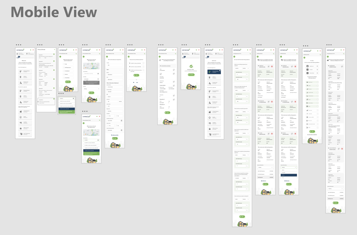
- High-fidelity designs: Prioritized accessibility, usability, and inclusivity. Added features such as smaller question sets, smarter input fields, a real-time progress bar, and summary screens.
Accessibility Testing
To ensure inclusivity, I conducted extensive accessibility testing:
- Used tools such as Stark, screen readers, color contrast checkers, and keyboard navigation testers.
- Involved users with disabilities to test the platform and ensure that it met WCAG 2.1 AA standards.
High Fidelity Design
Development and Quality Assurance
Close collaboration with the development team was critical for a smooth handoff:
- Provided design assets via Zeplin and conducted demo sessions to ensure alignment.
- Worked with the QA team to test stories and resolve issues through Jira.
Key Takeaways:
- User research was instrumental in identifying pain points and informing the design process.
- Collaborative ideation workshops fostered innovation and led to effective design solutions.
- Iterative testing ensured that the solutions met user needs and preferences.
- Accessibility considerations were critical to creating an inclusive experience for all users.
- Simplifying the application process and providing real-time feedback significantly enhanced user engagement and efficiency.
- Collaboration with the development and QA teams ensured a smooth implementation and high-quality output.
Post-Launch Analysis
After the full rollout, I conducted post-launch analysis to track key performance metrics:
- Completion rates, accuracy, and completion time were monitored using analytics tools.
- User feedback was gathered to inform further improvements.
The redesigned Client Centre offers a more streamlined and user-friendly experience, allowing mortgage brokers and their clients to complete loan applications efficiently and accurately.