
The Site Assure 2 Journey:
Reimagining On-Site Reporting for Major Road Projects Victoria with User-Centered Design

Site Assure 2 is a mobile application used by surveillance teams across Major Road Projects Victoria (MRPV) to record site observations, risks, and compliance issues. While the desktop system existed, the original mobile experience failed to support the realities of on-site work. As a result, critical information was fragmented, delayed, or lost altogether.
As the Senior UX/UI Product Designer, I led the redesign of Site Assure 2 to transform it into a tool that surveillance officers would actually use in the field—under pressure, in harsh environments, and with minimal cognitive load.
Note: Screens and detailed visuals are intentionally omitted due to government data sensitivity.
Why This Mattered
This project was not just about improving an app—it was about reducing operational risk on active road projects.
Surveillance officers are responsible for capturing critical safety and compliance information. When reporting is delayed, incomplete, or inaccurate, issues can be missed, escalations slow down, and safety outcomes are compromised. The existing workflow forced officers to duplicate work and rely on memory hours later, increasing the likelihood of errors.
My goal was to enable accurate, real-time reporting at the point of observation, without slowing officers down.
How Could It Make a Difference
A truly mobile-first, user-centred redesign had the potential to:
• Eliminate double handling of information
• Improve the quality and structure of data
• Reduce time spent on reporting
• Improve visibility of critical issues for supervisors
• Increase trust and adoption of the system in the field
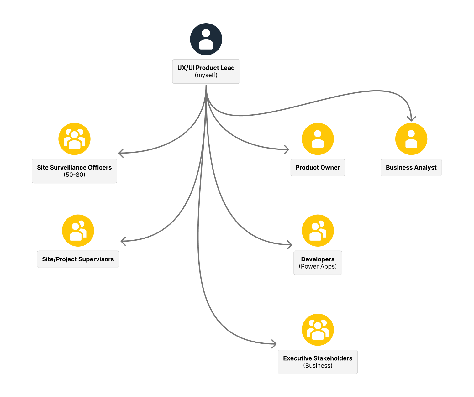
Stakeholders, Teams and Users
The project involved close collaboration across multiple groups:
Users:
- Site Surveillance Officers (50–80)
- Site Supervisors (6)
Internal Teams:
- Product & Business Analysts
- Developers (Power Apps)
- Executive stakeholders representing the business
Balancing operational needs, technical constraints, and executive expectations within a six-week delivery window required focused stakeholder management and clear decision-making.
Research Phase
Designing for Reality, Not Assumptions
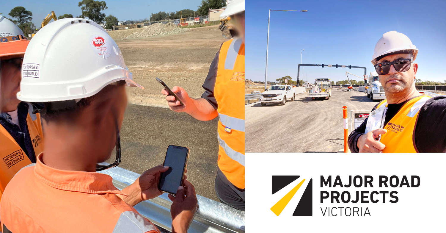
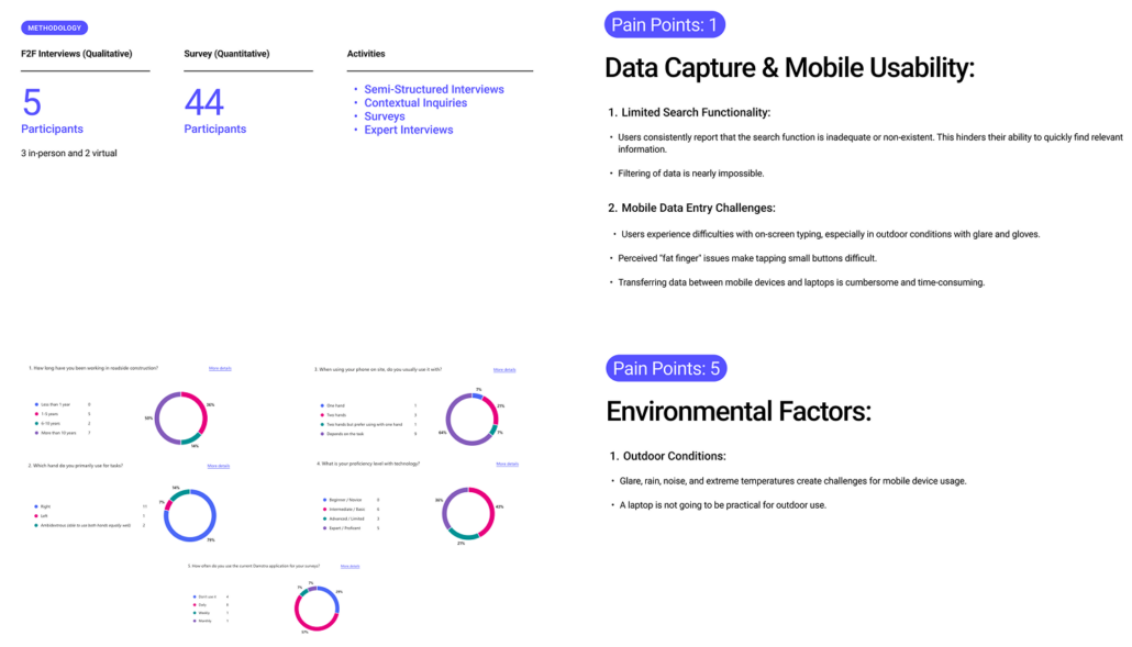
Before redesigning the experience, I focused on deeply understanding how work was actually being done on site.
I conducted interviews with:
- 5 surveillance officers
- 3 supervisors
- Developers, BA, and executive stakeholders
These sessions revealed that:
- Officers avoided the mobile app entirely
- Notes were captured across paper, voice memos, photos, and memory
- Reports were later submitted as a single unstructured block of text
- Photos lacked context, captions, or traceability
- Searching historical data was time-consuming and frustrating
Environmental Constraints
A critical insight was that the original design ignored the physical environment:
- Loud construction noise
- Bright sunlight and screen glare
- Rain and PPE usage
- Frequent one-handed operation
These factors became core design inputs rather than edge cases.
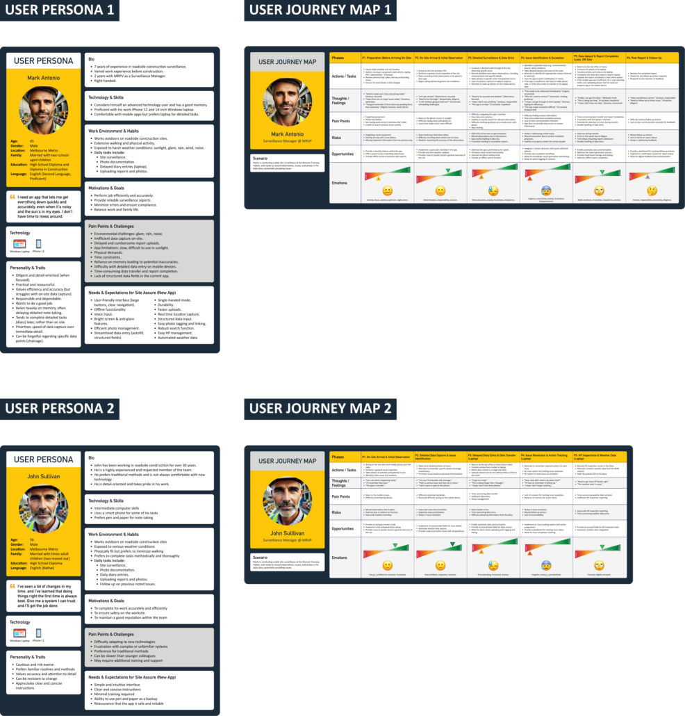
Personas & User Journey Maps
Research Report
The Challenge
The existing solution technically allowed reporting, but it was misaligned with user behaviour and context. This resulted in:
- Low adoption
- Delayed and inaccurate reporting
- Missed critical information
- Increased after-hours work
The challenge was to redesign Site Assure 2 into something that felt faster than paper, not slower than desktop.
The Vision
The vision was a mobile experience that:
- Required minimal typing
- Worked seamlessly with one hand
- Structured data automatically
- Captured context at the moment of observation
- Supported incomplete, real-world workflows
Design Exploration
User Journeys, Low-Fidelity Concepts, and Validation
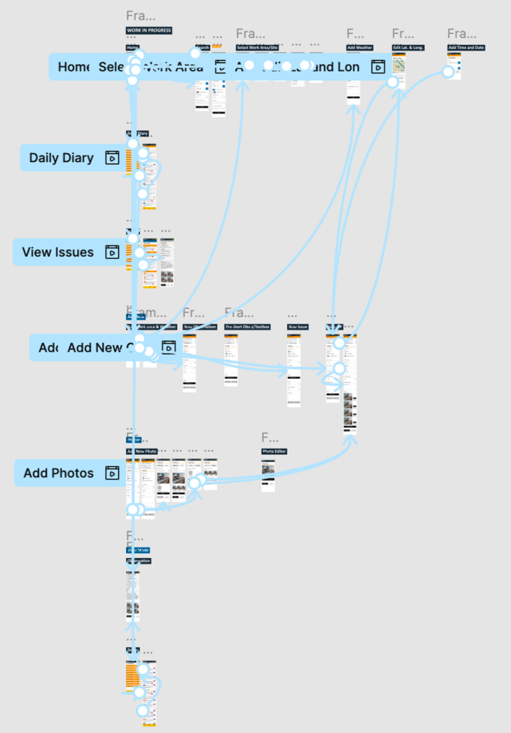
I translated research insights into:
- Simplified user journeys
- Low-fidelity wireframes
- Clickable prototypes for rapid validation
Early testing focused on speed, clarity, and effort, not aesthetics.
Design System
A lightweight, scalable design system was created to:
- Ensure consistency across forms and flows
- Support accessibility and outdoor visibility
- Enable faster development within Power Apps constraints
Accessibility and Inclusion
Accessibility was embedded from the start:
- WCAG-aligned interaction patterns
- Plain language for users with non-English backgrounds
- Large, bold controls for gloved or “fat-finger” use
- High-contrast colour choices to combat sun glare
- Full single-handed operation
This ensured the app worked for real people in real conditions.
The Solution
Crafting a Field-First Experience
1. Short, Structured Forms
Unnecessary inputs were removed and data was broken into clear, scannable categories.
2. Automation by Default
Location, weather, and site data were auto-captured to reduce cognitive load and errors.
3. In-App Media Capture
Built-in photo capture and markup removed the need for third-party apps and improved context.
4. Critical Issue Triggers
Editable rules automatically flagged and escalated critical issues.
5. Draft Reporting
Officers could start, pause, and complete reports later—reflecting real on-site workflows.
The Results:
The redesigned Site Assure 2 delivered immediate, measurable impact:
- 60%+ adoption within the first week
- 80% faster report submission, completed on the same day
- 80% increase in data accuracy
- 90% faster searching and review for supervisors
- Officers reported finishing on time without staying back after hours
The app shifted from being avoided to becoming the primary reporting tool.
Conclusion:
Designing for Context Creates Real Change
Site Assure 2 demonstrated how user-centred design—grounded in real environments, behaviours, and constraints—can transform not just a product, but an entire workflow. By designing for the realities of on-site work, we improved safety outcomes, data quality, and trust in the system.
